ShopDreamUp AI ArtDreamUp
Deviation Actions
Description
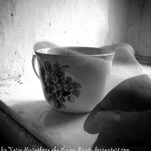
another experimantal shot and i would say i'm pretty content with finally doing this little trick quite nicely.
What do you think about it in general? I'm only starting to experiment with b&w -so ALL the comments and advices are very valuable!
he-he) 'gimme coffee and no one gets hurt' - Lintu-style
ps. now i am justified to buy a couple of new coffee-mugs or cups when something turns up - i'm running out of un-shot cups
 -- how do you like the concept implementation? how does this shot look as a b&w conceptual shot? what i can improve in making shots of such category in future?
What do you think about it in general? I'm only starting to experiment with b&w -so ALL the comments and advices are very valuable!
he-he) 'gimme coffee and no one gets hurt' - Lintu-style
ps. now i am justified to buy a couple of new coffee-mugs or cups when something turns up - i'm running out of un-shot cups
Image size
600x600px 109.07 KB
Make
Canon
Model
Canon EOS 450D
Shutter Speed
8/1 second
Aperture
F/22.0
Focal Length
18 mm
ISO Speed
100
Date Taken
Sep 8, 2010, 8:15:16 PM
Sensor Size
3mm
© 2010 - 2024 Ilman-Lintu
Comments33
Join the community to add your comment. Already a deviant? Log In
<img class="avatar" src="a.deviantart.net/avatars/t/h/t…" alt="
It was tone work and effective composition that first caught my eye here, and I think you are onto an interesting idea.
You have used the downward diagonal well - a far less common compositional feature, but effective here. You may have wanted to give the hand and cup a little more space by including some more wall on the left. The whole thing feels a little 'full' to me. But that said, it does give it an immediacy and a closeness. But overall, a little more space would have been better, I think.
Nicely done in keeping the detail on the cup - don't sell it too soon - you know how to photograph this one now! Nicely captured table texture too. It's a pity though that you have blown the whites behind. Bright light, or direct sunlight can be tricky, but certainly in this case I think it needs to be managed. Either use a HDR technique, layering an image with the correct exposure in at those points, or, if there is sufficient detail in the original, layer it off and adjust the intensity curves until you have some detail in the top end there.
The moving hand idea? (At least, that's what I think you meant to achieve!?) I would say blur the hand more - stop right down, set you ISO as low as it goes, tripod mount the camera (or put it on a table on a soft, mouldable pillow), use the self timer, and get a nice sweeping motion to the hand. And then, for me, let it be seen more. Blurred may work better this faint, and sharp may be better darker, but somewhere between the sharpness and the faintness, it is too lost for me. Blurring it from the stationery hand would work better for me.
And since you referred to coffee, and the lighting would make it work, it would be good to see the coffee, and a little steam. This comes across as a bit too sterile for an addiction image.
Great potential and idea though
Grant H


